Once you are in the Classic Editor, you have full control over every element in your survey. An element can be a question, a logic block, a reusable list, and more.
1. Adding a New Element #
To add a new element to your survey, click the + button that appears between two existing elements. This will open the New element window.
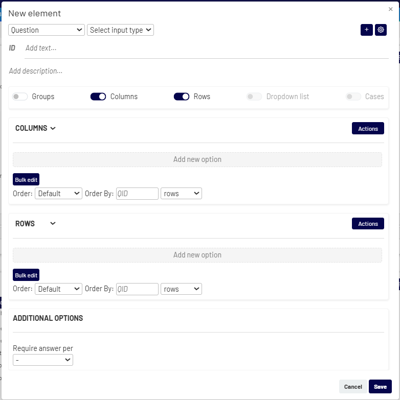
Your first step is to choose the Element type from the dropdown menu. The most common types include:
- Question: For standard question types like multiple choice, text, or number entry.
- Hidden question: For creating background variables or recoding data.
- Logic: For setting up conditional paths in your survey.
- Section/Loop: For grouping questions that can be looped.
- Custom module: For complex, pre-configured research exercises.
- Reusable list: To define a list of items (e.g., brands) that can be used in multiple questions.
This window allows you to configure your survey elements. The sections below describe the setup for a Question type, which includes several key configuration areas.
- Element Type
- Type: Select or change the element type using the dropdown menu (e.g., from Question to Hidden Question)
- Question Type: Change the input method (e.g., from Radio buttons to Checkbox or a Number input) using the dropdown menus. Available for Question and Hidden Question.
- Basic Information
- ID: At the top, you can define the question’s unique ID (e.g., Q1) and write the question text.
- Text: Write the question text.
- Description: Add optional helper text or instructions that will appear below the question for the respondent. Available for Question and Hidden Question.
- Answer Options (Rows, Columns, etc.)
This is where you define the answer option for your question. You can add different types of lists depending on the question format: - Groups: Organize answer options into sections. This is useful for grouping related choices under a common heading (e.g., categories or regions).
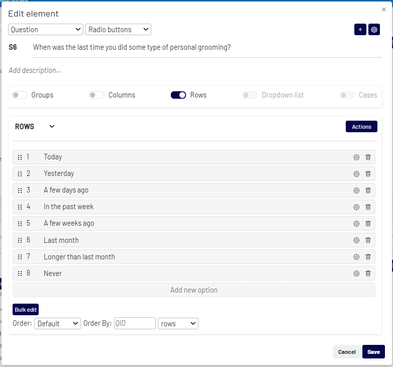
- Rows: The most common type, used for the answer options in single-choice or multiple-choice questions.
- Columns: Used to create grid or matrix-style questions where respondents rate rows based on columns.
- Choices: Used for dropdown-style questions with longer lists of answer options.
- Add new option: Manually add a new answer option.
- Actions
 : Access additional list-level functions:
- Switch type : Convert existing rows into columns (or vice versa).
- Insert list : Link or unlink the options to a predefined list.
- Delete all: Remove all answer options from the list.
- Bulk edit: Add or paste a large list of options at once.
- Set Order: Control the display order (e.g., default, random, rotate), and optionally link it to a previous question.
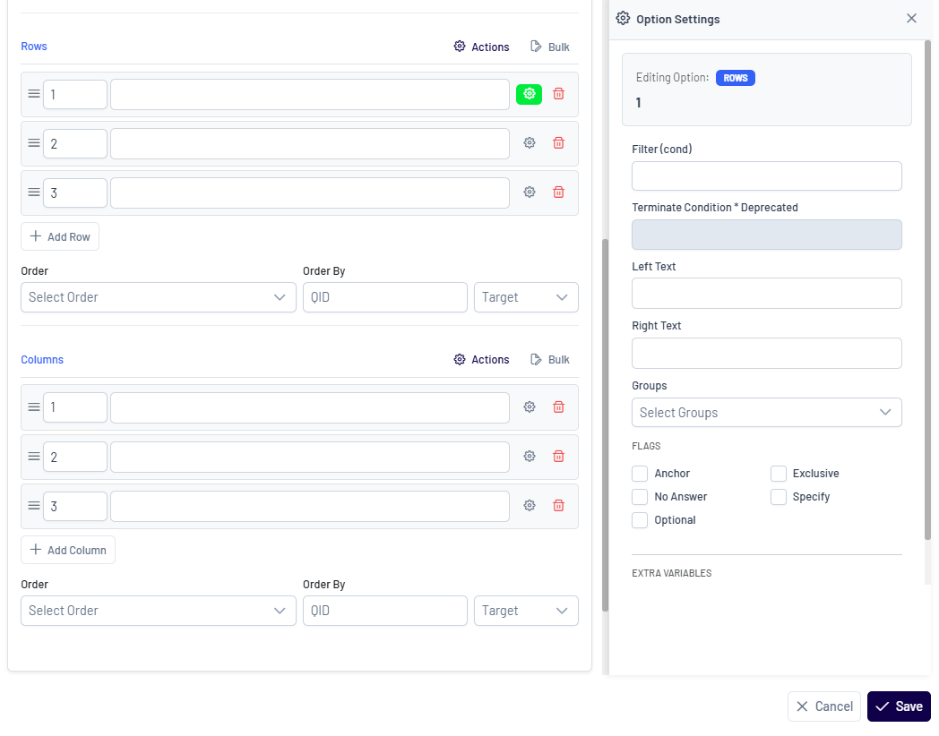
- Settings: Click the settings icon next to any answer to set specific properties like making it exclusive or an anchor.
- Delete: Delete only individual options.
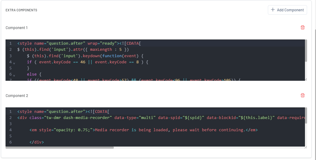
- Extra Components
- Advanced Settings
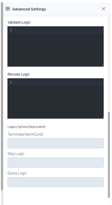
To access advanced logic and conditions, click the icon in the top right corner of the New/Edit This opens a dedicated view where you can apply more complex rules.
For each answer list, you can:
For each answer option, you can:
This section allows you to add optional components to the element. Multiple components can be added to extend functionality or customize its behavior.
For example, for a question element, you can add a Style component to control its appearance.
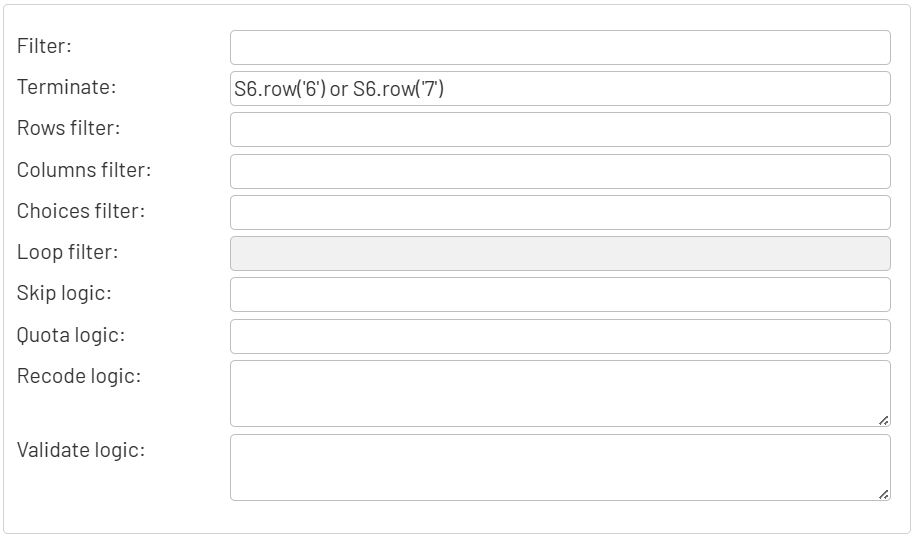
In this section, you can configure logic such as filters, validations, and recodes, as well as control how and when a question is displayed or how responses are processed. Additional options include page breaks, extra variables, and advanced survey flow settings.
2. Editing an Element #
To modify an existing element, click the Edit icon  in its toolbar. This will open the detailed Edit element window.